WageX—On-Demand Access to Salary
Optimizing & Redesigning the Experience of a Finance Web App
UI/UX Case Study • SaaS • Web App • 2023/24
Overview / TL;DR
I led the UX strategy and redesign of a Finance SaaS platform that enables employers to offer employees early access to their earned wages—before payday. My focus was on simplifying the employer onboarding flow, improving the overall user experience, and reducing friction that led to drop-offs.
Role & Responsibilities
Conducted contextual research & user interviews
Mapped current manual flows and pain points
Created low- and high-fidelity wireframes and prototypes
Collaborated with stakeholders for feedback loops
Led usability testing sessions and incorporated feedback
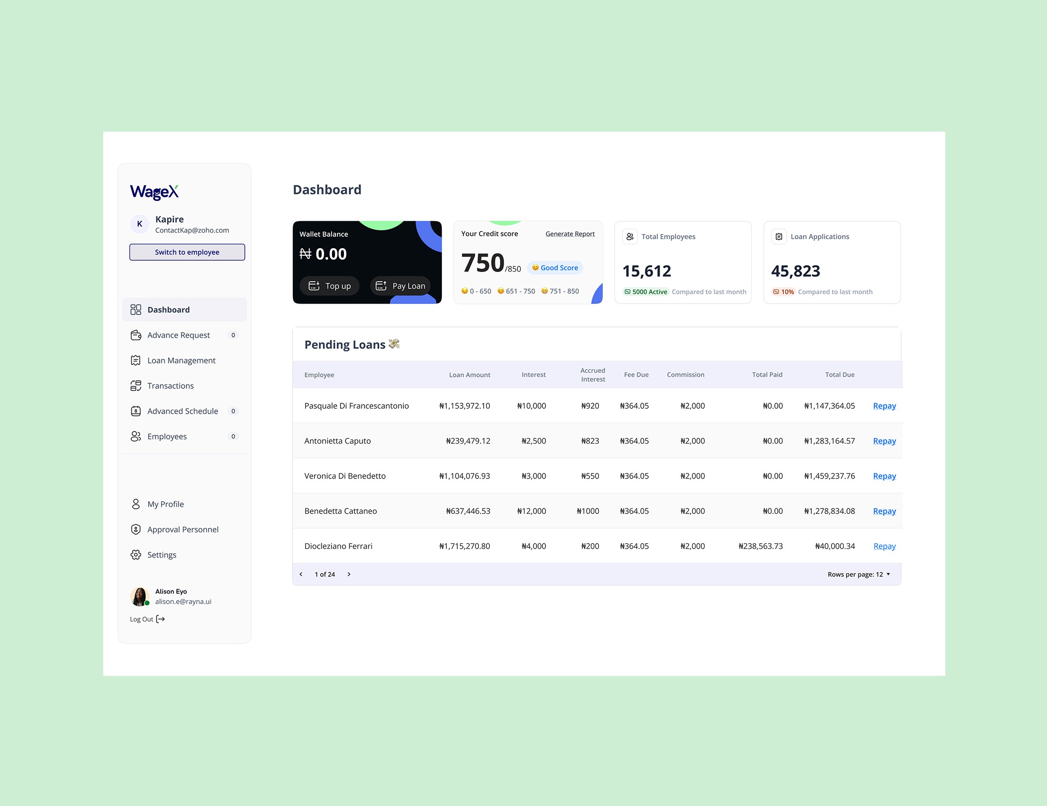
The Problem
The employer onboarding flow was lengthy, unclear, and did not allow users to pause and resume. This led to high drop-off rates and user frustration. Additionally, the platform’s interface lacked modern usability standards and structure.
Success Criteria
Reduce user drop-off during onboarding
Increase task completion rate
Make the process feel intuitive and efficient
UX Audit
To understand the core issues in the onboarding flow, I conducted a detailed UX audit of the existing WageX Employer Web App. Key pain points included:
Overly long forms
Lack of clear steps or guidance
No progress-saving capability
Poor visual hierarchy and structure
These seemingly minor issues compounded into a frustrating experience that caused users to abandon the flow.
Heuristic Evaluation
Due to time and resource constraints, I couldn’t conduct direct interviews with existing users. Instead, I analyzed public feedback from competing platforms like PaidHR. Comparing these insights with WageX helped validate my hypothesis on how the flow should be structured to better align with user expectations.
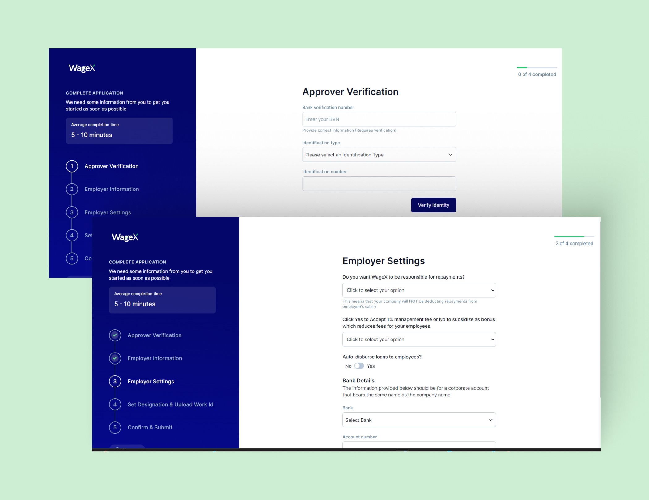
UX Strategy
My approach focused on minimizing friction and aligning the flow with users' mental models by:
Preserving familiar patterns and expectations
Redesigning the information architecture for clearer navigation
Enabling users to save progress and return without starting over
This strategy was aimed at making the experience feel intuitive, structured, and stress-free.
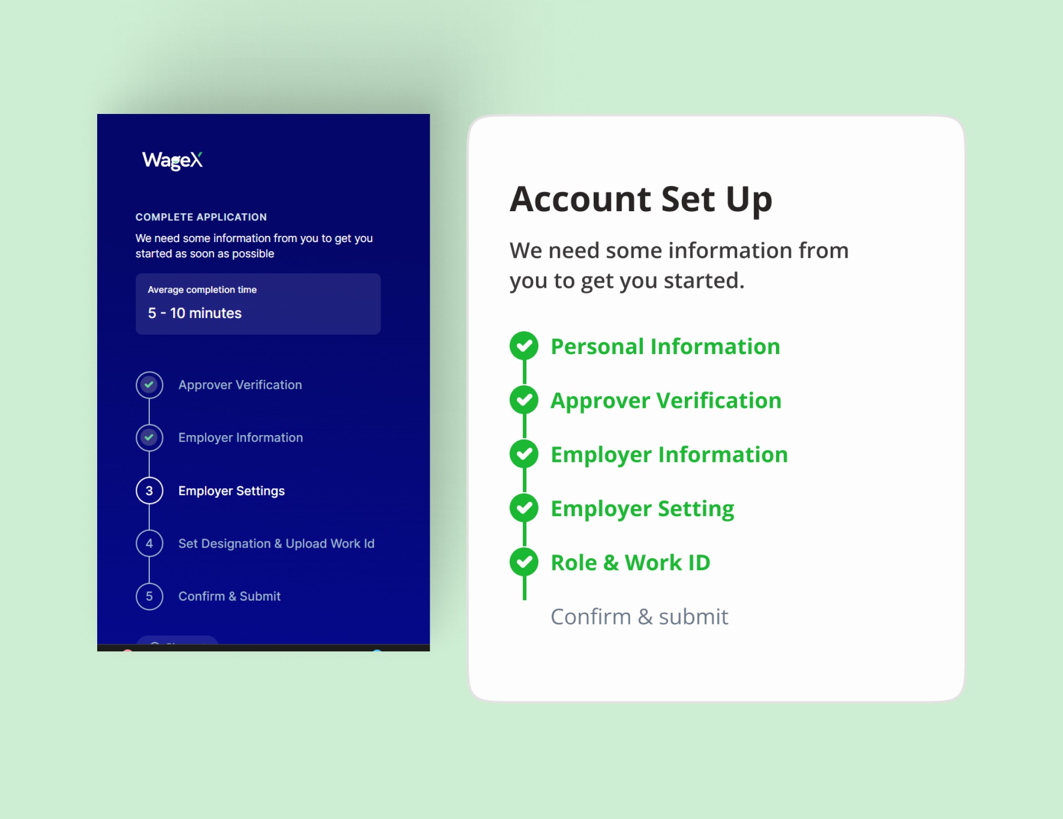
Wireframing & Prototyping
I developed low-fidelity wireframes of the revised onboarding flow and reviewed them with stakeholders to ensure alignment with business objectives. After several iterations based on feedback, I created high-fidelity designs and interactive prototypes to simulate the final experience and prepare for handoff.


Usability Testing (Curb-Cut Effect in Action)
Although I couldn’t access WageX's existing users, I tested the redesigned flow with individuals who are not familiar with fintech tools or complex digital platforms.
This approach followed the Curb-Cut Effect—designing for those with greater accessibility needs often improves usability for everyone.
The results confirmed the effectiveness of the redesign:
✔️ Participants completed tasks with ease
✔️ The flow felt clear and manageable
✔️ Forms were no longer overwhelming, and the language was user-friendly
Outcome & Impact
⏱️ Onboarding time reduced by 25%
✅ Completion rate increased by 40%
Reflection & Lessons Learned
This project deepened my understanding of mental models—and how simplifying a flow isn’t just about fewer steps, but about preserving familiarity and intuitive structure.
What I’d Improve
In future iterations, I’d conduct usability sessions with existing users to validate how the updated flow aligns with their expectations and behaviors.
SAFE-WAVE
Designing a seamless ticketing experience for jetty Lagos commuters
Jetty Ticketing App & Management
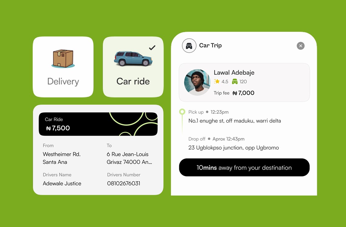
GUDU
Designing the experience of a package delivery, & ride-hailing app
Send Packages Wherever, whenever